
Lazio Jersey 1997-98

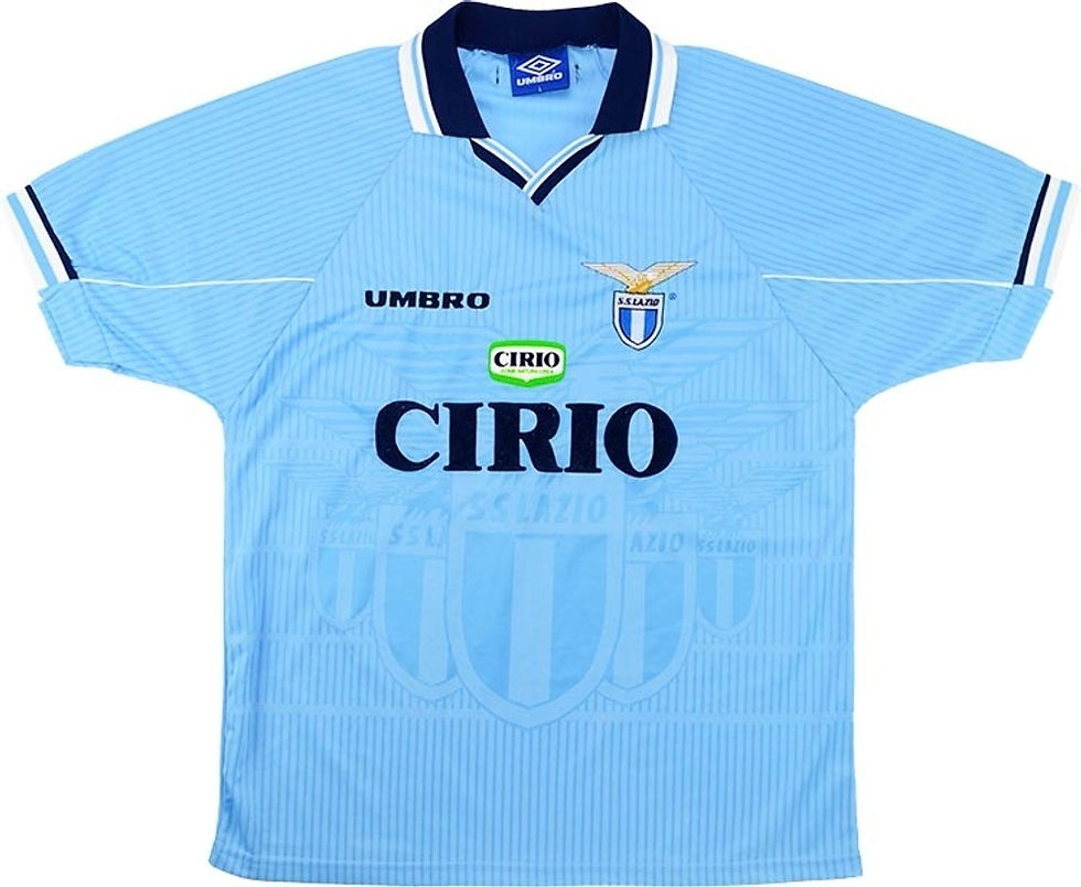
After 10 years as the club's kit supplier, this would be the final season with Umbro.
The shirt was very attractive and carefully designed, featuring a soft shade of sky blue and references to the club's official emblem incorporated into the fabric's pattern. The collar and cuffs were trimmed in blue with a thin white stripe.
The shirts worn by the Biancocelesti players featured the same velvet-like "flock" heat-transfer lettering used the previous season. Only one font style was used for the names, which were curved. The number font was more rounded in design than that of the previous season. The numbers no longer featured the Umbro logo placed diagonally across them, but instead had it positioned at the bottom of the number. For the UEFA Cup, the numbers featured neither lettering nor a logo.
Image Sources: Football Kit Archive except third jersey (SS Lazio Museum)
Umbro retained the same shirt design used the previous season for the away kit. On the yellow second shirt and the blue third shirt, the "S.S. Lazio" lettering was embroidered into the fabric pattern, while on the retail version it was printed. The blue third shirt was also brought back for this season and was nicknamed "Nuvola" ("Cloud") because of the graphic pattern across the chest, which resembled a bank of clouds. The shirt retained the same personalisation design as the previous season, with the Umbro lettering and a more square-shaped graphic.
The goalkeeper shirt still continued in the vein of the “Campos effect”. Jorge Campos, Mexican goalkeeper, played with in shirts he designed himself with very bright colours and rather bizarre, for the footballing media, patterns. This year the jersey was slightly more straight forward compared to previous seasons, but still intriguing.
Sources


Comments